Output Arcade
Output Arcade 2
Redesigning discovery, search, and navigation for a music production platform used by over 300,000 producers monthly.
Follow The Money
Arcade launched strong. But paid subscriptions started tapering and pricing promotions weren't moving them — that pointed to a product problem. Average time from first login to first meaningful export was 2.2 weeks. The trial window was one week. Producers were churning before they ever had a reason to stay.
For every 23 samples a producer opened, they saved one. Users were exploring constantly, but almost nothing was landing.
On new kits not featured on the homepage.
Nearly two-thirds of all searches ended without engaging a single result — a direct signal that results weren't trustworthy.
Average time to reach a first meaningful action. For a 1-week trial, that's too slow to convert.
We believe that by improving our content discovery, trial users will reach their first meaningful moment faster — and a producer who finds sounds they love will pay to keep finding more.
How might we help users quickly discover and explore new music samples that aligns with their taste, especially as we release new lines each week?
Bringing Content Closer
Before committing to a full taxonomy rebuild, I tested the lighter lift: consolidating search
and browsing into a single unified view.
The hypothesis — producers were abandoning searches because results were scattered.
The metric didn't move. The problem wasn't visibility. Producers were finding results.
They just weren't trustworthy enough to act on.
A cleaner UI can't fix inconsistent metadata — and a failed experiment is easier to pitch than a hypothesis.
Option 1 gave us the evidence to make the infrastructure case internally.
What We Found
It wasn't the UI causing Attrition
The tagging system had been built manually and inconsistently over years — "percussion" and "percussive" were different buckets, returning different results. Individual tags were surfacing a few hundred results from a library of thousands. The content existed. The system had splintered it.
Fixing the taxonomy wasn't one of the solutions — it was the prerequisite.
A producer who can't trust the data doesn't find sounds. A producer who doesn't find sounds doesn't export. A producer who doesn't export doesn't convert.

I organized the redesign around three place where the content surfaced — the only places that could actually move the conversion needle:
Get Users Closer To Music
Simplify the IA so the structure matches how producers actually move. Getting artists closer to the music.
Fix The Foundation First
Standardize the entire content library. Without this, search is unreliable and discovery can't personalize. Everything else depends on it.
Content Discovery Powered By Data
With structured metadata in place, make the home feed adaptive — algorithmic recommendations that actually work because the tags are now trustworthy.
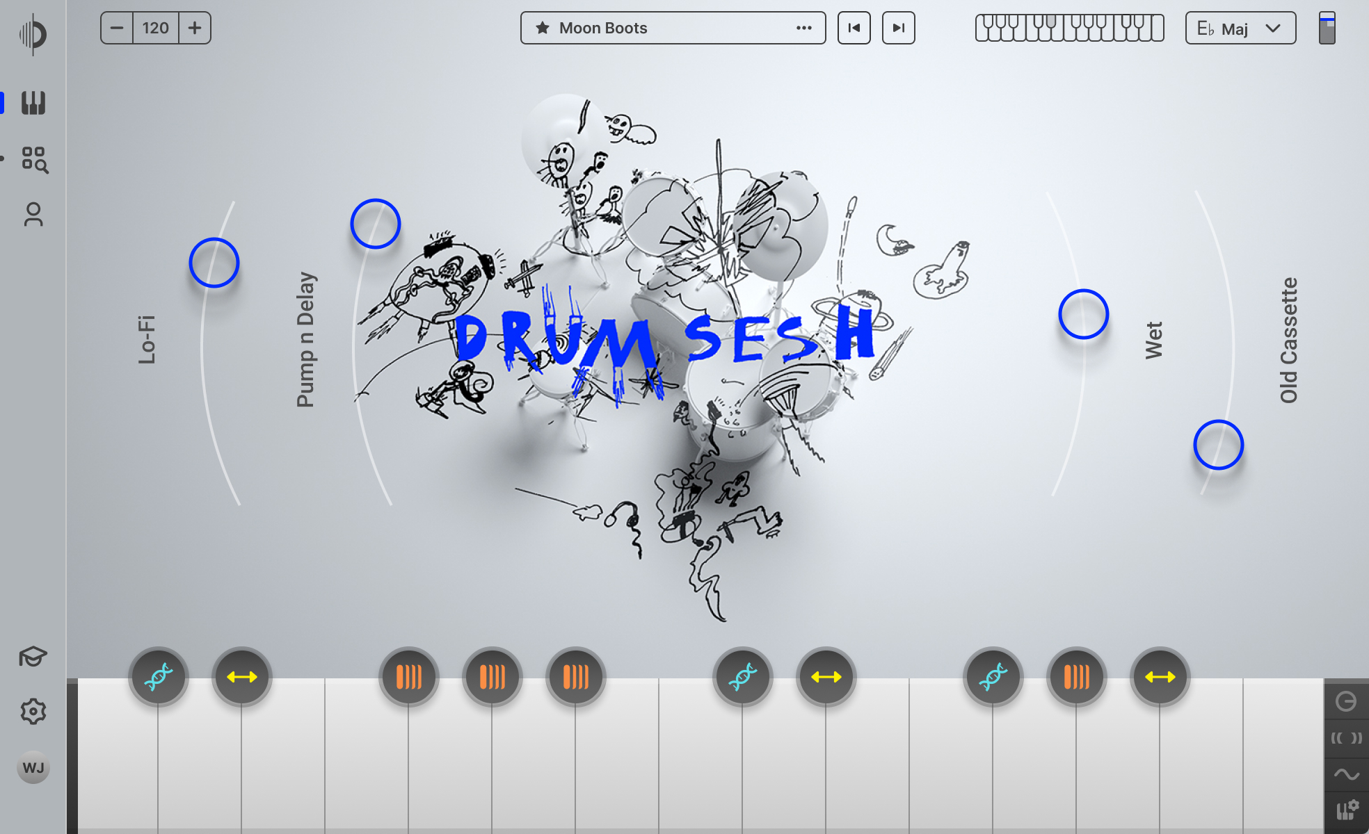
Navigation
Closer To The Music
In 1.0, a persistent sidebar meant every session started with producers orienting to the interface before they could think about music. Confusing navigation also drove avoidable support tickets.
We replaced it with three sections: Play, Browse, Your Stuff. Simple enough to internalize on first use. We also unified the kit player and browser — previously two separate views — into one.

Play, Browse, and Your Stuff
Three clear sections replacing a sidebar-driven structure. Simple enough to internalize on first use.
Removed Sidebar
Eliminated the persistent sidebar that required producers to orient before they could create. This also cut discovery-related support tickets significantly.
Unified the Kit Player and Browser
Previously two separate views — merged into one continuous experience. Less context switching between exploring and playing.
dd
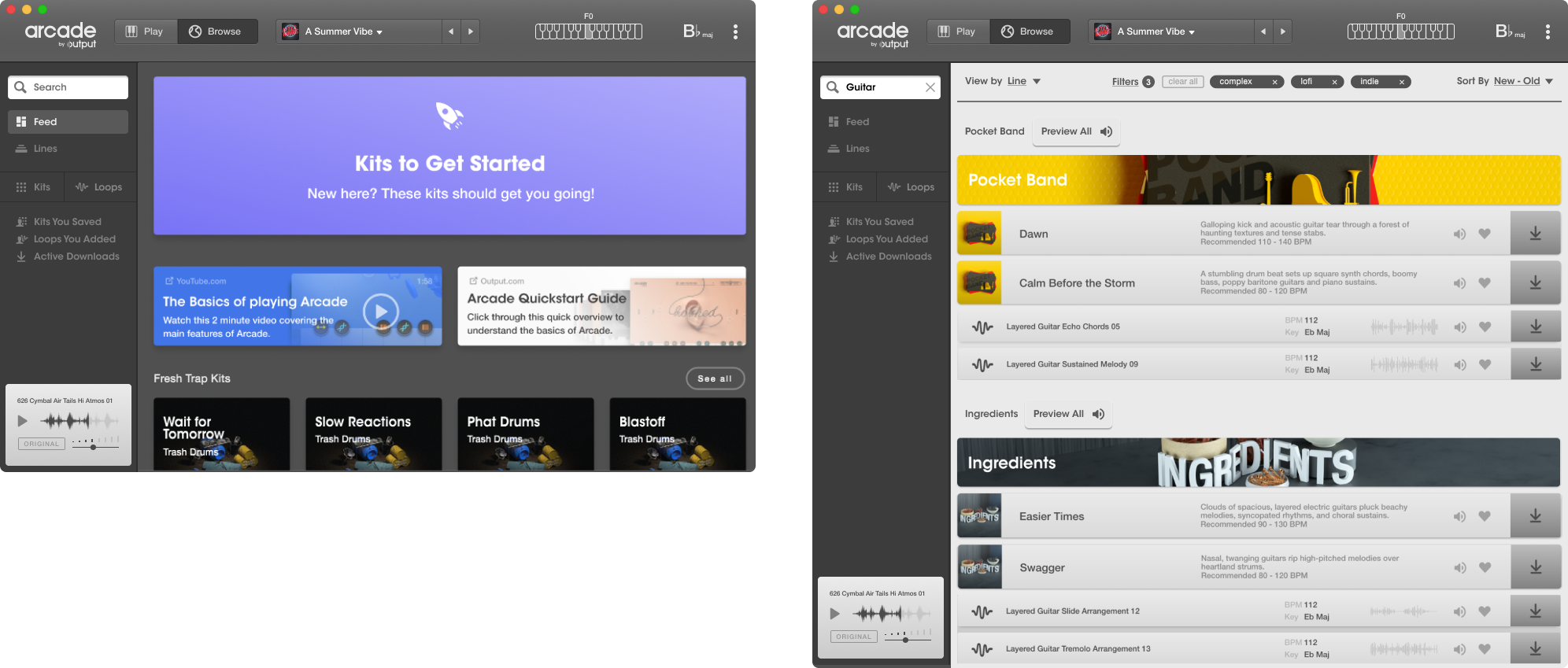
Search
Organizing Chaos
Search was the heaviest lift and the right place to start. A producer who trusts search is a producer willing to pay — and with clean tags underneath, the home feed could finally personalize.

Global Search, Available Everywhere
We introduced a unified global search that works across the entire library — from kits and lines to individual samples. Users can now search from any screen, including within their personal libraries and Output's full catalog.

Rebuilding The Taxonomy
We analyzed existing metadata patterns and mapped them to genre, mood, instrument, BPM, key. Every piece of content in the library was re-tagged against these similarities. The same instrument now had one name. The entire catalog finally spoke the same language.
Getting this approved required a reframe: not a cleanup task — product infrastructure. The tagging system would power search, discovery, and future personalization. Without it, none of those things scale.

Results That Reduce Steps
In 1.0, search returned kits — so producers still had to navigate inside a kit to reach individual samples. We redesigned results to surface samples directly. Combined with accurate tagging, this single change drove most of the search engagement lift.

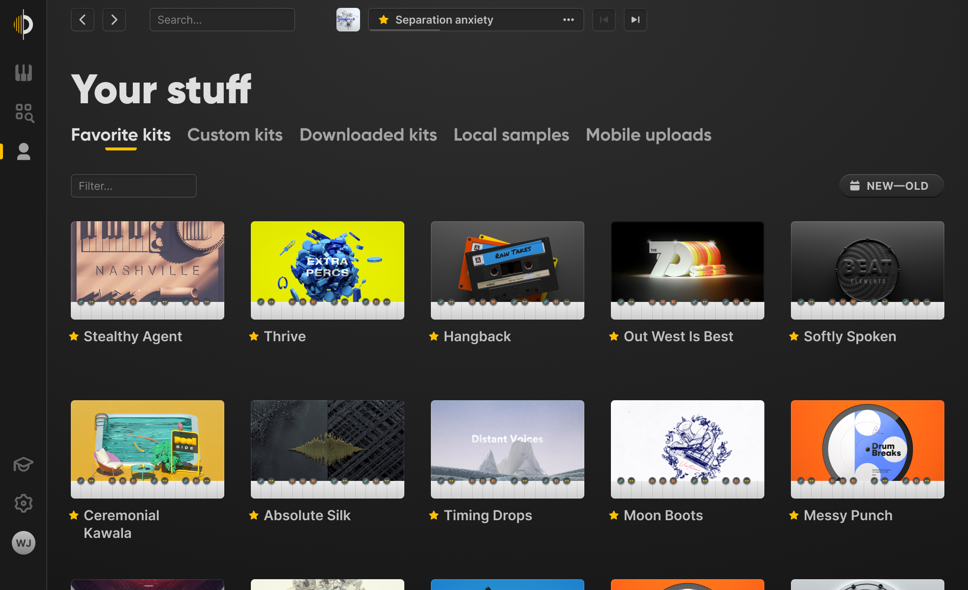
Homefeed
Tailored Content Powered By Data
The 1.0 feed was fully static — every producer saw the same content regardless of what they'd played, saved, or searched for. With clean taxonomy in place, we could finally fix that..

Unified View
Merged Feed and Lines into a single Browse view, eliminating an unnecessary context-switch.
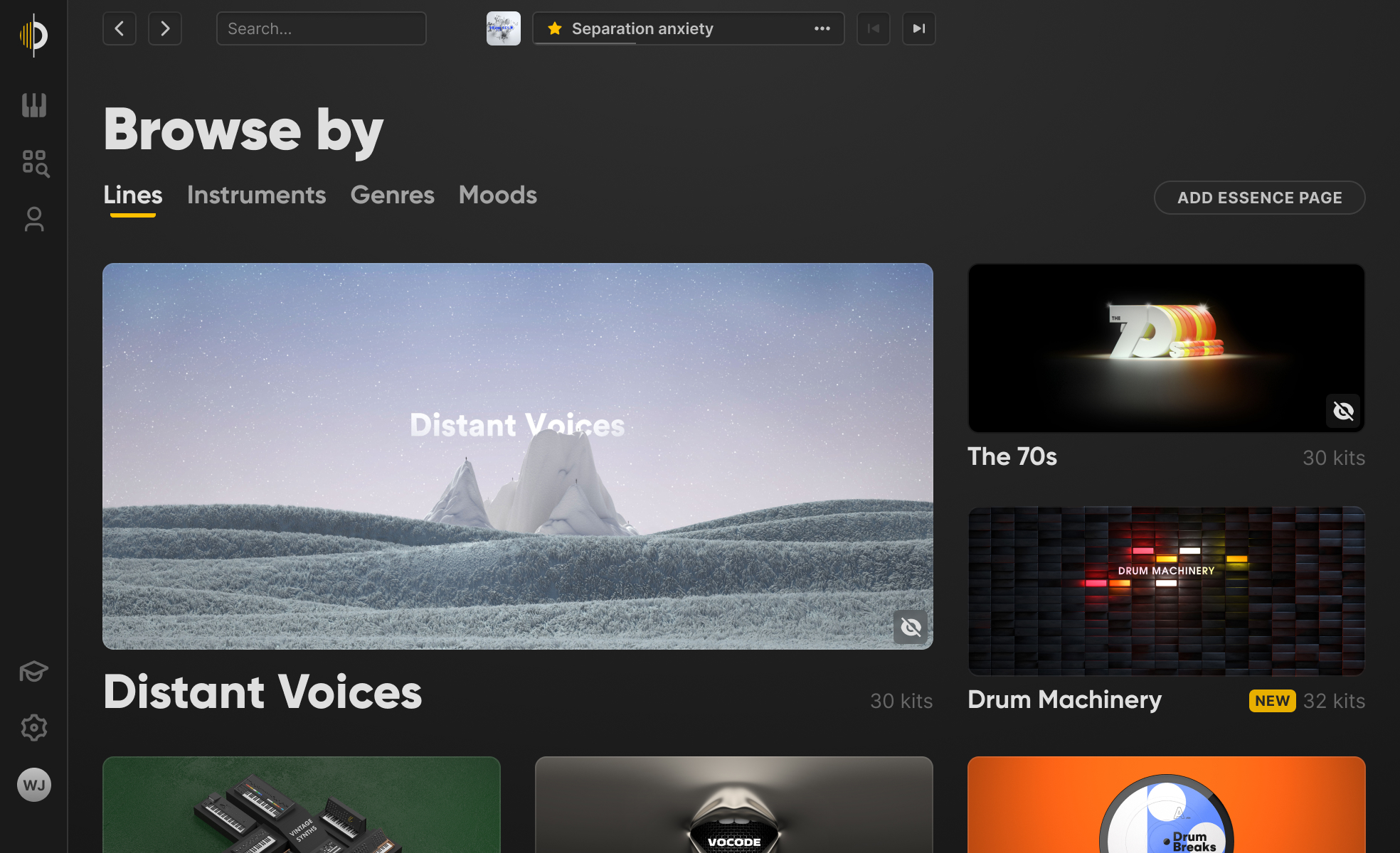
Multiple Entry Points
Previously, producers had to navigate into a full kit before previewing samples — two or three minutes before realizing it wasn't right. Structured tags let us add entry points by instrument, genre, mood, and BPM — however they were thinking that day.

Hybrid Feed
Algorithmic recommendations layered with editorial curation. Fully algorithmic risked irrelevant content. Fully editorial wouldn't scale. The hybrid gave us relevance at scale with a quality check on top.
Weekly Kit Mix
A curated, auto-updating Weekly Kit Mix to re-engage lapsed users and encourage exploration. It adds a lightweight social element while surfacing trending content in a fresh and digestible format.

Prototyping & Empty States
Designing for the edge cases
Empty states
Skeleton screens keep the interface feeling alive during load. When search returns nothing, producers aren't dead-ended — they're redirected into a Browse by view with an Everything fallback. The session keeps moving.

Prototyping
The Figma prototype served two purposes: user testing, and engineering reference. The interactions were complex enough that written specs were losing detail in translation. A live prototype gave engineers a ground truth to reference during build and QA.

Components
Design system & Cross-platform
Arcade runs on web and as a plugin inside DAWs. UI constraints differ across surfaces — the mental model has to stay consistent. I built the design system in Figma with named components tied to variables, keeping taxonomy and discovery language consistent across both. Developers had a single source of truth.

Impact
Results that validated the diagnosis
Producers were finding music samples much quicker and tailored to them.
Search shifted from a last resort to a primary entry point — decreasing the numbers to only 18% abandonment.
Users finding value faster, creating new songs quicker. Still outside of the trial window but a huge improvement.
Users were finding the magic moment, which gave them clear value of the product.
Next Steps
What this unlocked
In creative tools, momentum is the product. What looked like a navigation problem was a systems problem. Once we fixed the infrastructure, the surface improvements almost designed themselves.
Search wasn't working
63% of searches ended without a single result clicked. 23 samples browsed for every one saved. Producers were leaving without finding anything worth keeping.
We tried the easy fix
Consolidated search into a single unified view. The hypothesis: producers couldn't find results because they were scattered. The metric didn't move.
The data was broken
The problem wasn't visibility — it was the underlying taxonomy. "Percussion" and "percussive" were different buckets. We rebuilt the entire tagging system from scratch: genre, mood, instrument, BPM, key.
Infrastructure, not just a fix
Clean metadata powered everything downstream — a home feed that personalizes, recommendations that adapt, content surfacing that doesn't require manual curation. One infrastructure decision compounded across the entire product.
Reflections
Surface problems often have infrastructure roots
The UI improvements were downstream of fixing the metadata. Doing UI work first would have been polished and ineffective.
Design has to sell infrastructure investment
Getting the content team to re-tag the library required reframing it as product infrastructure, not cleanup. Designers are often the advocates for invisible work that makes everything else possible.
A prototype is a communication tool, not just a test artifact
Building a Figma prototype as an engineering reference eliminated more implementation confusion than any amount of written documentation could have.
Research & Project Goals
Based on our user research methods of conducting 1:1 interviews with producers of our existing product and studio sit-ins. We discovered 3 distincted opportunities to streamline the creative process of music making and increase discoverability.